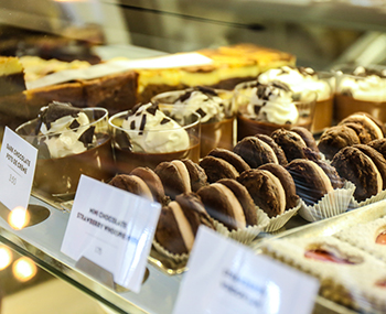
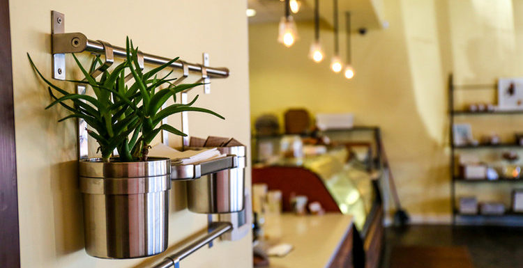
Dolce Bakery, a made-from-scratch bakery nestled in the Village shops of Prairie Village, is just the spot for beautiful and delicious sweet treats guaranteed to keep you returning for more. The popular, long-time resident of the Village found herself in the enviable spot of outgrowing the kitchen at the original Dolce Bakery, necessitating the move to the more spacious current location. The practical move quickly evolved from a simple re-location to an exercise in branding awareness and an opportunity to refresh the bakery’s brand.
Avoiding the Cookie-Cutter Look
This included working with design expert Brent Anderson to create a branding campaign including a new color palette and font along with a redesign of the space. “I know what I like, but I love working with experts who are just as passionate about what they do as I am about baking,” Erin said.
After six years at the original location, Erin had a good idea of how she wanted the new location to look and feel, but when she didn’t find what she was looking for she wasn’t shy about asking for advice. True to the bakery’s every batch from scratch motto, Erin started at the beginning, seeking out the expertise of local craftspeople regarding the look and design of the dining and bathroom areas.
A Cohesive Approach
Throughout the light and airy space, Dolce Bakery visitors will find a comfortable, lived-in area warmed by handmade lights and accents of chocolate-colored local wood around the pastry cases, front counter and shelving, designed by Randy Taylor of RWT Design and Fabrication. When it came to the bathroom design, Erin choose to switch up the plans during the construction phase and move the bathroom facilities from the back of the building to the front to add more space in the kitchen.
With the bathroom in a more prominent location, Erin decided a cohesive look would be necessary. Here she envisioned a simple bathroom design that would translate as shiny, bright and pretty and feel clean and fresh. Some things remain easier said than done.
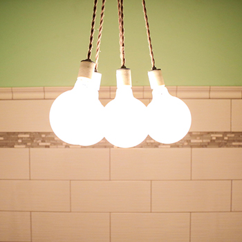
After coming up empty-handed at the tile store, Erin approached the store’s resident tile expert for advice on tile for the new bathroom space. His recommendation included a large, shiny white subway tile set in a subtle wave pattern. Several aisles over, he pointed her toward tile accents jeweled with clear mosaic glass. The room is finished with architectural accent tiles at the top and bottom, and a soft minty green color from the Dolce Bakery color palette completes the clean, white bathroom and creates a sense of cohesiveness with the rest of the space. The bathroom also features an unexpectedly elegant pedestal sink and oval mirror. It should come as no surprise that the 2015 Battle of the Brands winner also receives kudos on the bathroom design with customers asking to snap a picture of the bathroom on their way out the door.
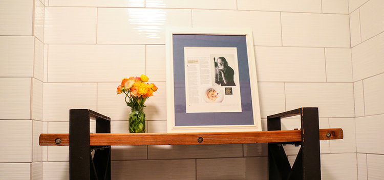
“Everything about the design is an extension of what we’re trying to do.” Erin said. “People come here to share food, conversation and emotions, and I want them to feel at home and comfortable anywhere in this environment.”
Check Dolce Bakery out HERE, and make sure to stop by for your Valentine’s goodies!
